
I got a fresh tutorial to transform your footage from flat and lifeless to cinematic and unique. In this guide, I’ll walk you through the basics of color grading, showing how to take your clips from “meh” to “wow” with tools like DaVinci Resolve and custom LUTs. Whether you’re a beginner or looking to refine your skills, you’ll learn how to give your videos that polished, professional look.
Why Color Grading Matters
Many creators shy away from color grading because it seems complicated. They stick to shooting in standard profiles to avoid the hassle. But here’s the thing: shooting in default settings means your footage will look like everyone else’s. If you want your videos to stand out, color grading is essential. It’s not as hard as you think, and it gives your projects a signature style that sets them apart.
The Tools You’ll Need
I’ll be demonstrating with DaVinci Resolve, but you can apply these principles in most professional editing programs like Final Cut Pro, Adobe Premiere Pro, or even LumaFusion on an iPad. The key features you need are:
- Control over exposure, contrast, shadows, highlights, and mid-tones.
- The ability to apply and adjust LUTs (Lookup Tables).
Step 1: Setting Up Your First Clip
To import media, go to File > Import > Media. For this tutorial, I used footage shot with a Canon M50 and CineStyle, paired with a Sigma 18-35mm lens.
Open the Color Tab
At the bottom of your screen you will see different icons representing different tabs.

Select the dots in a circular shape. This is the Color tab, where all of your work is concentrated.
Understand Nodes
The top right corner of your screen is where the nodes will be. Think of nodes as layers in Photoshop. They allow you to adjust individual aspects of your footage as layers without affecting all of it.
First Node Setup
Add a “Corrector” node by right-clicking in the node area, rolling over Add Node, then selecting Corrector. (See the video above)
Connect it to your footage by linking the green and square inputs (see below). Once connected, you have your first node.
Step 2: Adjusting Exposure and Contrast
Now, let’s tweak the basics: At the bottom of your screen you have 4 color wheels: Lift, Gamma, Gain, and Offset. To the right of the color wheels, you have your waveform.
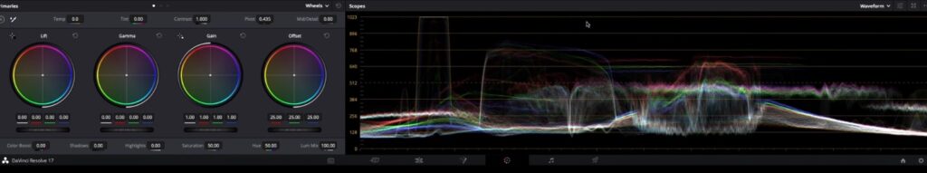
The bottom of the waveform (scope level near 0) represents pure black, and the top of the waveform (scope level near 1023) represents pure white.
Mid-Tones
Use the Gamma wheel to adjust brightness. Skin tones should sit near the middle of the waveform monitor, so center the pattern in the middle of the waveform.
Shadows
Lower the Lift slider to deepen shadows, but avoid going too low to prevent noise. I like to elevate it a little bit above the 0 scope level.
Highlights
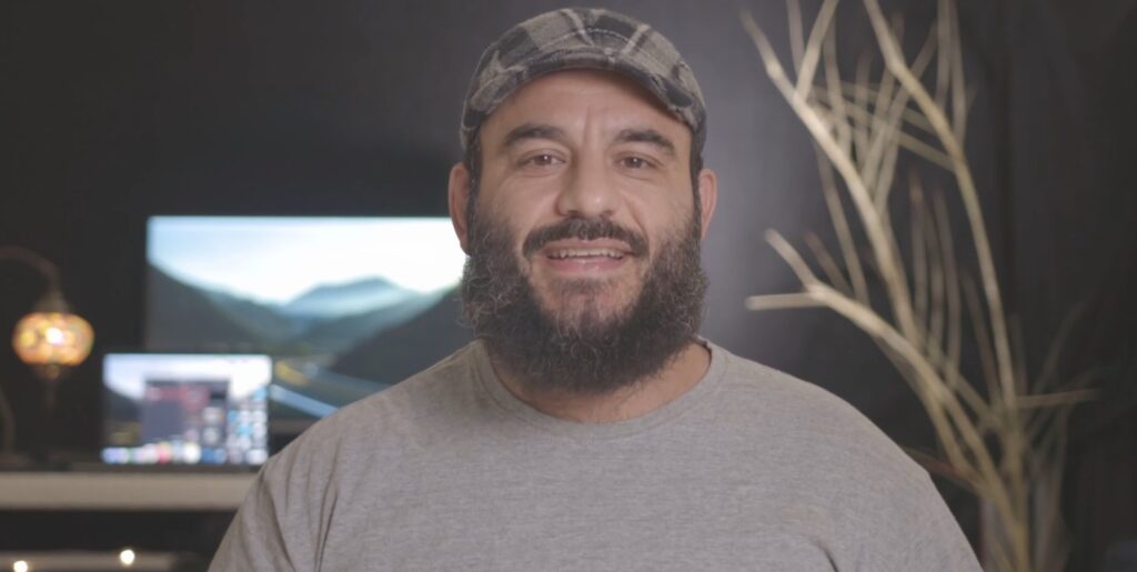
Slight overexposure in certain parts is okay if it helps your subject stand out. For example, in the footage above, the overexposure of the sunlight helps accentuate the subject in the image.
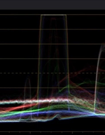
To control your bright areas like lights and windows, or to adjust your exposure, click on the Gain wheel.
For example, in the footage I am using, the high level of whites comes from the lamp and monitor in the background. You will see in the high level in the waveform denoting this exposure level.
This is ok since it does not overwhelm the image.
Step 3: Adding Contrast and Saturation
Add contrast until the image looks vibrant but natural. For Canon M50 CineStyle footage, I like setting contrast to around 1.2. The Contrast setting is above the Gain wheel.
Increase saturation moderately; 54% is a good starting point for a balanced look. The Saturation setting is below the Gain wheel.
Step 4: Introducing the S-Curve
The S-curve adds depth and dimension to your footage, by darkening shadows and lifting the highlights. Just remember to adjust it sparingly as small changes make a big difference. To use the S-Curve, we will first start by adding a Serial Node: Double-click the node, rollover Add Node, then select Add Serial.
After you add the Serial Node, you will need to go to the Curves tool. To access, click the Curves icon in the toolbar above the wheels. The Curves tool will then appear below.

For my image, I want to slightly darken my image. To do so, I will grab the circle marker at the bottom of the line and drag it right to darken the image:
Next, I will create the S-Curve by clicking on the line in the the lower-mid range and dragging it slightly lower. Next, I will click and drag the higher-mid range slightly up to create the curve:
TIP! As soon as you can see the effect, you probably want to dial it down a notch. Every adjustment you make will add up. If you overdo each element, it will make the image look unnatural.
Step 5: Applying LUTs
LUTs (Lookup Tables) can give your footage a signature style with minimal effort. To add your LUT, add a new Serial Node by double-clicking the previous node > Add Node > Add Serial.
Add the Lut
Double-click the new serial node to access your menu > LUT > LUT folder > your desired LUT. For my project I am using my own custom LUTs, available for purchase here. I will choose the Teal & Orange Juice LUT since it gives this footage deep, rich color.
When you add the LUT, you will most likely notice the intensity is too much. Most LUTs work well between 10-80% depending on their default intensity, but I often tone most of my LUTs down to 30-40%.
Adjust the LUT
To tone it down, we will click the Key icon in the toolbar above the color wheels. This icon looks like 2 rectangles on the right side of the toolbar.

Once you click the Key icon, the Key tool will appear below.
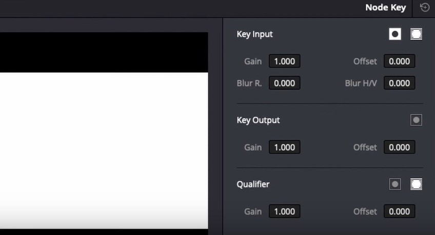
I like to focus on the Gain field under the Key Output section, which helps you control the Gain element of that particular node. In this case, it will adjust the opacity or strength of the LUT.
In my adjustment, I settled for around .55. The lower you go, the less obvious the LUT is; the higher, the more intense it is. You can adjust yours as you see fit.
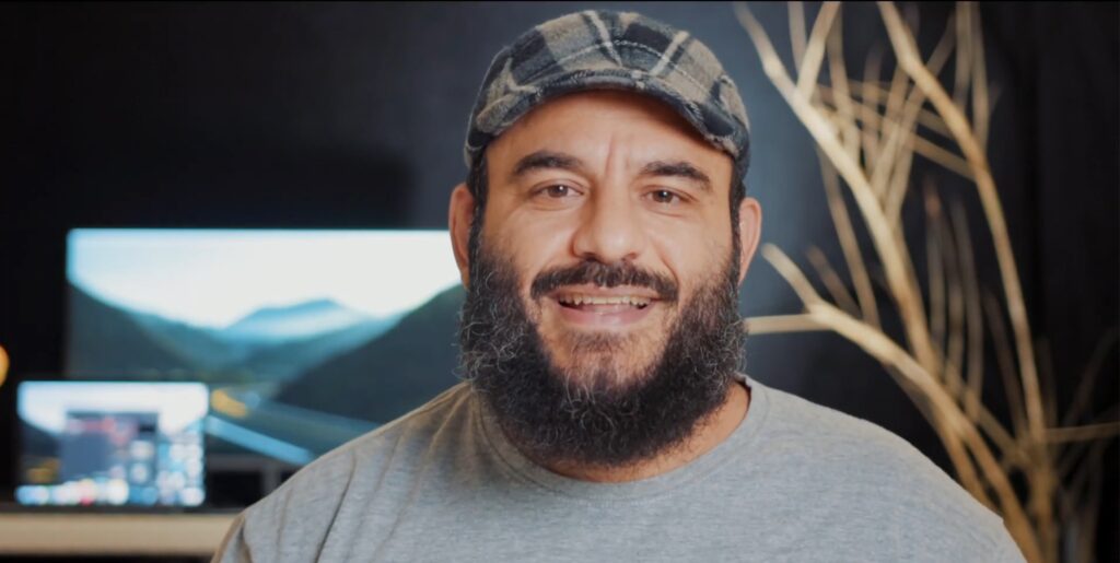
Once done, you should see the cinematic difference:
Matching Mood with Color
Color grading isn’t just about aesthetics; it can tell a story. For example, in the rainy scene below, I applied my “Ice Water” LUT to emphasize the cold, moody atmosphere. By dialing it down to 25%, the footage retained its realistic rainy-day vibe without looking overly stylized.
Other times, you want to color grade to achieve a specific purpose. For example, you might want to match footage from one camera to another, or take footage shot in the daytime but make it look like it’s evening. Whatever the case is, color grading can provide a powerful impact you can’t achieve without that extra effort.
Final Touches
Once you’ve graded your clips, review them in sequence. Look for consistency in exposure and color tone across all shots. If you’ve followed along, your footage should now look polished and professional. Check out the before and after of my LUTs here:
If you like any of these LUTs featured, you can find them in Fulaan’s Filmic LUT Pack 1. Want more LUTs? Then buy the discounted Fulaan LUT Pack Bundle instead!
Conclusion
Color grading doesn’t have to be intimidating. With practice, you can transform ordinary footage into something truly cinematic. If you found this guide helpful, then check out my YouTube channel for more tips and tricks. To get the LUTs used in this tutorial, then visit my shop.
Ready to take your video projects to the next level? Let’s get grading!